Embargo
Crafting a Mobile Experience That Drives Engagement and Rewards
Revamped Embargo’s mobile app and business portal to boost user engagement, refresh the brand, and deliver a scalable rewards experience for both customers and venues.
Project Overview
I led the full redesign of Embargo’s mobile app and CRM portal, transforming both the user experience and visual identity. Through user interviews, product audits, and a design overhaul, I focused on simplifying navigation, improving discoverability, and creating a vibrant rewards ecosystem. The final result was a more modern, user-friendly platform that encouraged venue discovery and helped businesses drive customer loyalty.
Status
Shipped
Role
Year
Dec 2017 – Dec 2018
Product & Audience
B2C Hospitality
Skills
Product Design
Mobile Apps
Design Systems
Final Solution
We successfully redesigned Embargo’s ecosystem with a fresh, intuitive, and rewards-driven experience that elevated both the brand and product.
Highlights
An end-to-end redesign of Embargo’s mobile and business platform — blending loyalty, exploration, and brand engagement into one cohesive experience.

Understanding the Problem
Embargo’s original app had an outdated UI, poor navigation, and low reward engagement. I was brought in to reimagine the entire experience — from brand identity and user journeys to business tooling and reward visibility.
Key Challenges
Brand identity was outdated, with inconsistent visual language
Reward engagement was low, as users struggled to track and redeem offers
Navigation lacked clarity, making it difficult to discover venues or rewards
CRM tooling was limited, preventing businesses from targeting users effectively
Research & Insights
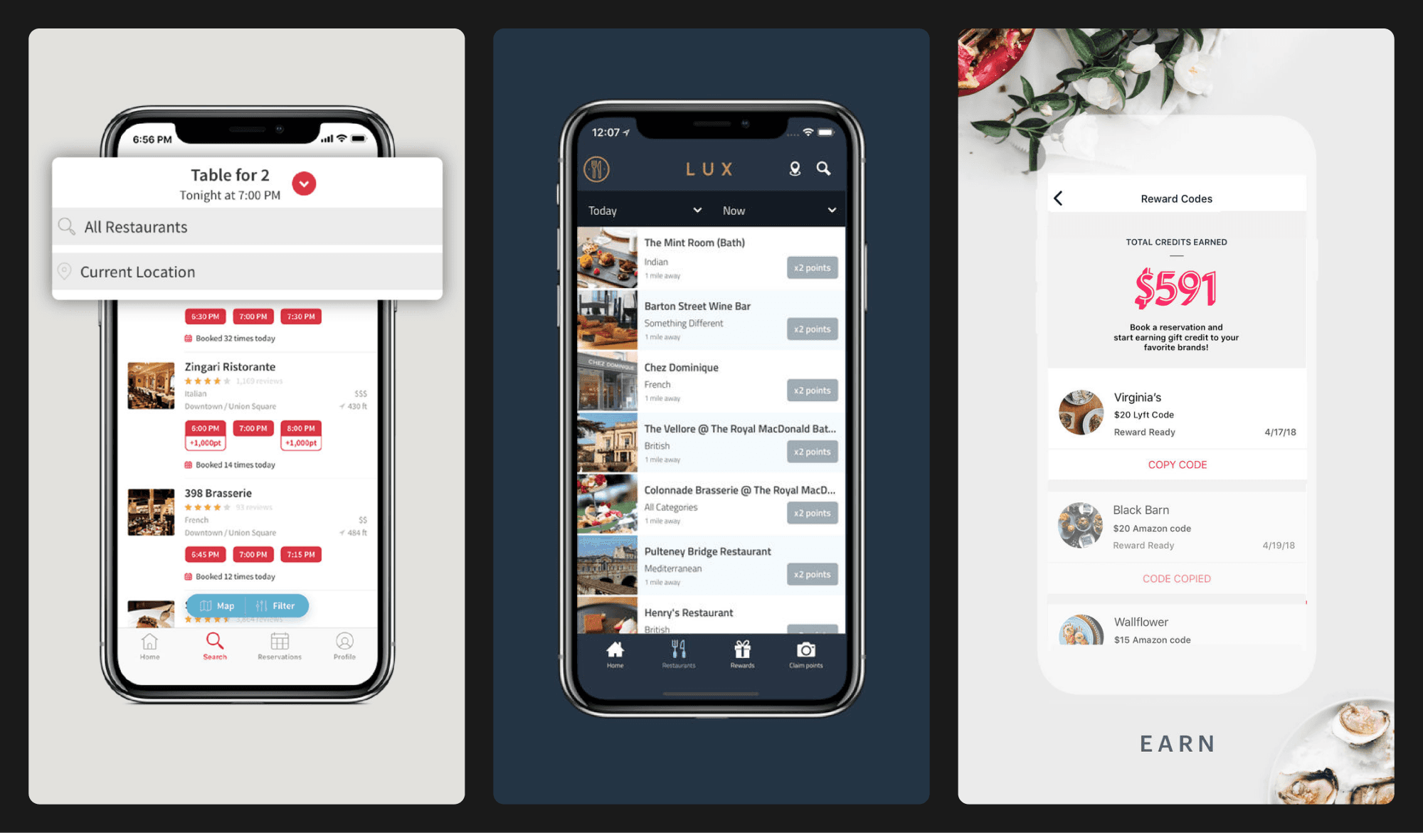
I conducted competitive analysis and product assessments to understand user expectations and pain points across similar loyalty ecosystems.
Competitor Analysis
Identified motivators used by other loyalty apps
Reviewed reward visibility and redemption mechanics
Noted gaps in discoverability and personalisation
Product Assessment
Annotated the current app with UX and UI issues
Remapped user journeys across app and portal
Discussed pain points with internal stakeholders

User Research
I interviewed users aged 18–30 in London to understand how they discover venues and what influences loyalty behaviour.
Many didn’t know where to start when exploring
Overloaded listings made it hard to find deals
Trust and familiarity influenced where they returned
Core Design Values
Scalable – Built for growth in venues and reward types
Enjoyable – Easy, effortless, and intuitive on the move
Focused – Emphasised core flows like claiming rewards and nearby discovery
Final Designs & Key Screens
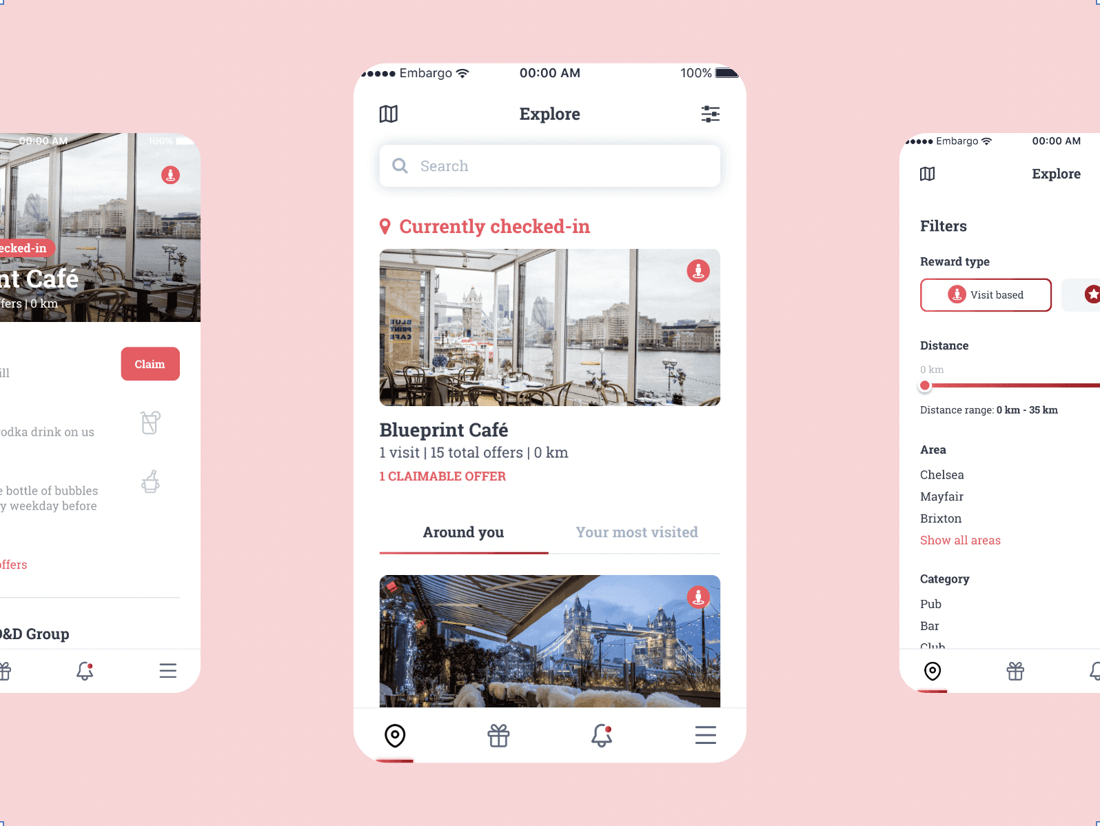
Home / Discovery
Effortless venue exploration and rewards at your fingertips
This screen helps users quickly discover nearby bars, cafés, and clubs with claimable rewards. The redesigned experience makes it easier than ever to explore, filter, and take action directly from the map or list. Whether users are new to London or looking for familiar favourites, this screen serves as the gateway to the app.
Current check-in status is clearly shown on both list and map views
Smart filtering by reward type, distance, area, and category
Highlighting claimable rewards front and centre to increase engagement

Reward Tracking
Motivating loyalty through visual progression and easy redemption
The reward screen provides a timeline view of visit- and stamp-based rewards to encourage users to return. The structure allows users to track progress, see upcoming incentives, and easily claim rewards with staff when ready.
Progress-based timeline shows how many visits remain to unlock new rewards
Clear breakdown of offers by visit or stamp, tailored to the venue
Claim screen designed for in-person use, requiring staff to approve in real time

Navigation Tabs
Clean, simplified navigation built for real-world usability
The bottom tab bar was redesigned to prioritise ease of use, with an intuitive layout and a familiar mobile app pattern. Thoughtfully selected icons and labels improve recognition and reduce cognitive load, particularly useful when users are on the go.
Explore tab for discovering venues nearby
Rewards tab lets users find and claim available offers
Notifications tab for updates, check-in info, and marketing campaigns
Menu tab to access account settings and personal rewards

Iconography
Custom red line icons to unify food, drink and reward types
To elevate the app’s visual identity and improve clarity, I designed a bespoke icon set using red line art to align with the refreshed brand. These icons clearly represent various food, drink, and reward categories, bringing personality while maintaining a clean, minimal aesthetic.
Visual cues help users instantly identify reward types
Unified icon style ensures consistency across the UI
Icons add delight and clarity to the reward experience
Designed for scalability across app and marketing touchpoints

CRM Portal
Business tools for customer insights, offers, and performance tracking
The Embargo web portal gives business owners the power to track, manage, and grow customer engagement.
Analytics dashboard for check-ins, claims, and returning customers
Customer insights to identify top spenders and loyal guests
Offer management for creating visit- and stamp-based rewards
Notifications hub to engage with users via in-app messages

Marketing Campaigns
Built-in tools for re-engagement and customer loyalty
Embargo’s CRM platform includes a lightweight but powerful campaign system.
Email templates designed for quick promotion building
Push notifications that can be triggered by behaviour or schedule
Segmented messages targeting specific customer groups
Performance tracking to monitor campaign success

Key Takeaways & Learnings
Start small, scale fast – Focusing on high-impact areas built momentum for full rollout
Simple navigation boosts usage in real-world hospitality settings
Designing for both B2C and B2B creates scalable, dual-sided value
Clear, visible reward tracking increases redemption rates